STAY CURIOUS
Keep reading to find the excellency out of perfection and skill.
By: Milestone 101 /
2025-05-03
bollywood
The Magic of colour Palettes in Bollywood Cinema: How Directors Use colours to Set Tones, Moods, and Themes in Their Storytelling
This article explores the crucial role of color in Bollywood cinema, examining its psychological and cultural significance. It highlights how directors use color palettes to convey emotion, develop characters, and reinforce themes in iconic films. Discover how color acts as a powerful visual language, enriching storytelling and leaving a lasting impact on audiences.
Cinema converges both the story and the performances. It is verbal or performative, but cinema is also visual. A director has one of the most acute, yet so often subconscious, tools available to communicate emotion, theme, and narrative, which is achieved by a simple colour palette. India has a wealth of heritage, culture, and history, and Bollywood willingly represents this in cinema. Whether reproducing a post-colonial cityscape or conjuring a setting and story from one’s imagination, design in cinema is as vital to a story’s constitution as is its hero.
Although we commonly associate Bollywood with flashy costume designs and exuberant dance numbers, the use of colour in films goes beyond just a cosmetic effect. When used with purpose, colour becomes a form of cinematic language that communicates volumes without a single word.
In addition, colour does so much for the audience watching a movie. First, colour establishes the film's tone and takes us to the world created by the maker. Colour also serves a directional purpose by focusing on details of significance that might have been verbally communicated to the audience. Colour represents character traits and is very effective in evoking memories, sentiment, and even strong psychological responses. Finally, colour can serve as an essential element to signify the development or arc of a character or a story.
As the most prolific film industry globally, Bollywood has long recognised the unspoken influence of colour. While dialogue, song, and action share the burden of creating meaning, it is often colour that does the real work: expressing emotion, reinforcing themes, and shaping the tonal texture of a scene. Indian filmmakers have historically embraced bold, saturated images, with each colour loaded with cultural, emotional, and narrative associations. From the volatile reds of love and revolution to the disquieted blues of sadness, colour palettes in Bollywood films are narrative tools, not simply decorative choices.
Once again, directors like Sanjay Leela Bhansali, Karan Johar, and Satyajit Ray have, in various ways, used colour to shape our cinematic experience. Bhansali's Bajirao Mastani had a magnificent tonality of gold, red, and green shades that evoked opulence, passion, and political clout, respectively. Karan Johar utilised monochromatic thematic concepts throughout his songs, such as "Suraj Hua Maddham" from Kabhi Khushi Kabhie Gham, where emotion fell flat in contrast against overwhelming backdrops. Even a horror-comedy like Stree used neons and shadows as narrative devices that distorted reality, contributing to its horror and fear.
Colours aren't just seen—they are felt, remembered, and often become as much a symbol as the film they represent. Because India has deep cultural significance with specific colours–white can signify mourning, red can signify weddings, and saffron can signify spirituality–Bollywood directors can use colours that have defined associations to help layer their stories. Our culture of visual language is evolving, and so is the craftsmanship of the Bollywood palette.
In this article, we approach colour as both canvas and character and examine the transformative role of colour in Bollywood films that have captivated audiences and critics with their unforgettable colour palettes.
The Psychology of Colour in Films
Before we move to the films, let me share some thoughts about the psychology of colour. Colour psychology has an important role in creative visual storytelling. Warm colours (red, orange, yellow) can evoke emotional responses and perceptions, such as positive emotions, energy, passion, aggression, and urgency. Cool colours (blue, green, violet) may evoke feelings of calmness, melancholy, or contemplation. This distinction becomes even more pronounced given Bollywood's overarching storytelling style.
Take, for example, the colour red in Devdas (2002). From Chandramukhi's red saree to the interior aesthetics of Paro's home, Devdas is saturated in red, indicating passion, sacrifice, and the tragedy of love. The colour red is not just love, but also destruction and fate. In Dil Chahta Hai (2001), the aesthetic is dominated by blue, with many key scenes featuring the cast in Goa, which invokes a relaxed, nostalgic, and contemplative tone while reflecting the emotional waves experienced by its colourful characters.
Before we dive into Bollywood examples, it's important to understand colour psychology. Each colour has emotional and cultural value, which impacts how audiences perceive and feel. Here are some psychological associations with primary colours:
Red evokes feelings of passion, aggression, danger, and/or love. However, it's most importantly an emotionally charged colour often used to indicate extreme states or emotionally charged relationships.
Blue represents calmness, isolation, sadness, or introspection. Many films that deal with loneliness, melancholy, or philosophical themes use blue.
Yellow: Implies warmth, energy, and optimism, but can also imply jealousy or instability.
Green: Represents nature, growth, envy, and tranquillity. Green can change the tone of a scene, from hopeful to ominous.
Black: Conveys power, fear, mystery, or death. Many thrillers and dark psychological films make use of black.
White: Represents purity, innocence, or sometimes cold distance.
Orange: The combination of the energy of red and the cheerfulness of yellow conveys enthusiasm, transformation, or a sense of chaos.
Colour as a Tool for Character Development
Characters in Bollywood are often associated with specific colours, which evolve through their arcs. Writers, costume designers, and directors constantly debate how to use visual signals to display characters' inner states.
Take Queen (2014) for example. Rani's metamorphosis is indicated through her changing clothes—the wardrobe starts muted and conservative, and with time, slowly develops into brighter tones as she liberates herself and gains self-determination in Europe. Therefore, non-verbal colour is not merely pretty, but liberatory and transformational, mapping her internal freedom.
In Tamasha (2015), Ved's two identities are mapped with colour. In Corsica, Ved is loud, colourful, and full of stories, while at home in India, he dresses in dull grey and brown, indicative of conformity and repression. The colours establish the diversity of emotion regarding his internal conflict and his journey towards authenticity.
Directors Who Master the Palette
Certain Bollywood directors are now closely linked to distinct colour palettes; they treat each frame of their film as if it were a canvas.
Sanjay Leela Bhansali: Bhansali may be the most recognisable figure in this regard. Olms (Goliyon Ki Raasleela Ram-Leela, Padmaavat, Bajirao Mastani) are visual assemblages; they are completely packed with colour, featuring rich, vivid, and saturated tones and using gold, reds, and steel blue in a way that brings to life images and scenes of grandeur, tradition, and passion. Bhansali uses colour to foreshadow heightened emotional stakes and dramatise romantic and moral conflicts.
Anurag Kashyap: Kashyap's colour world is grave, raw and grungy. Black Friday (2004), Gangs of Wasseypur (2012), and Ugly (2014) have desaturated and earthy tones. Kashyap's films often overrun browns, greys, and off-whiteness, establishing a world of decay, chaos, and toxicity. His minimalist colour palette correlates with the stark realism present in his narratives.
Zoya Akhtar: Zoya's colour strategy is contemporary and layered. The colours in Zindagi Na Milegi Dobara and Dil Dhadakne Do feature fresh, pastel colours that serve as modern references to urban self-discovery, alienation, and class issues. The colour used in Zoya's films is visually pure, often featuring blue and white to accentuate the emotional undercurrents beneath the glossy surface.
Karan Johar: Karan tends to use sentimentality and melodrama in his narratives. He uses colour to assist with thematic dichotomies as identified in Kabhi Khushi Kabhie Gham, in which the visual quality of the ultra-rich Raichand family (golds, deep reds, opulence) is contrasted with the warmth of the colours associated with the humble Sharma household (warm yellows, light browns), supporting notions of class separations and the warmth of family.
Songs, Dreams, and Fantasies: A Visual Symphony
Bollywood songs have always acted not just as song breaks, but as moments of emotional inflexion, fantasy sequences, and cultural expression representations. Beyond their inherent musical nature, Bollywood songs are visually distinct due to the unique visual language established by the flamboyant use of colour palettes. More than just decoration and embellishment, colour palettes anchor the mood, genre, themes, and internalities of the song and visuals. Let's explore how songs come to life visually through clever palettes in Bollywood films like Deewani Mastani, Aaj Ki Raat, Dhindhora Baje Re, and others. Often, songs in Bollywood represent a sensory overload, and colour plays a significant role. However, songs are also the moment filmmakers can amplify their visual imagination, resulting in a focus on surreal palettes that expose dreams, memories, and fantasies.
In Hum Dil De Chuke Sanam (1999), the exuberant song "Nimbooda" uses intense blues, oranges, and pinks to capture the festive and traditional nature of the performance. In Bhansali's hands, folk colour anchors the visuals in Rajasthani culture. Yet, he also elevates the mood of pure exuberance.
In Barfi! (2012), the song, "Phir Le Aaya Dil," is presented in sepia tones with low saturation to achieve a timeless and melancholic feel. Director Anurag Basu creates a relationship between colour and memory; the warm fading of colour suggests nostalgia, bathing the narrative in bittersweet melancholy.
In the song "Deewani Mastani" from Bajirao Mastani (2015), the video is a beautiful, dream-like visual experience like nothing I've seen before. The song takes place in an ornate Darbar, and the colour palette is soft, romantic, and delicate, featuring ivory drapes, golden chandeliers, and rose-tinted lighting. Mastani is costumed in muted peach and gold, reflecting restrained passion and nobility. Bhansali effectively creates warmth in his colour palette, producing a sensual and respectful aura while also portraying love as divine and destined. The soft flame of the candlelight reflects off the marble and turns every frame of the song into a Mughal miniature painting, brought to life.
In "Dhindhora Baje Re" from Rocky Aur Rani Kii Prem Kahaani (2023), the song is visually grand, exploding with reds and golds, highly reminiscent of classic Bollywood cinema. However, this is not just visual splendour, it is thematic splendour as well. Red, a standard colour used in Indian weddings and rituals, can signify various things, including conflict, climax, and convergence, which essentially creates a lot of meaning and layering. The colour red provides a celebratory and confrontational quality to the song as it embodies a messy familial and emotional showdown in this plot-heavy tune.
In 2013's Yeh Jawaani Hai Deewani, the song "Balam Pichkari" is set in Holi, which turns the film frame into a paint canvas; every time a colour is thrown, an emotion is released. Each colour establishes an emotional transition for the character from a childish blue to a lustful crimson or a bright yellow. The meanings conveyed by the hues feel fresh and contemporary, vibrant and young, and throw expressive moments of joy, freedom and flirtatiousness in the air through the use of colour.
In 1998's Dil Se..., the visually poetic song "Jiya Jale" is filmed in Kerala, a wonderland of lush green foliage and crimson costumes. The contrast of using the reds of passionate desire against the much calmer palette of nature suggests that love is both primal and sacred. Preity Zinta's red sari cuts against the leaves, bright red and bravely emanating a passion free from local cultural restraints. The soft light and mist captured through Santosh Sivan's cinematography suggest a smoother, more dreamy, intimate world.
In "Ghoomar" from Padmaavat (2018), the choreography is accompanied by its sonorous use of colour—the deep maroons and gold embroidery signal royal heritage. Bhansali maintains symmetry in set design, costume and placement of colour, visual order, and richness, thereby endorsing Rajput pride and clarity of conduct.
In "Gallan Goodiyan" from Dil Dhadakne Do (2015), the elegantly staged one-shot party number employs tasteful evening wear and soft party lighting to create a sexualised upper-class glamour while generating deeper emotional tension. The carefully curated colour palette is both austere and chic. The visual metaphor represents repressed feelings and the pretence contained within family façades.
In the song "Kesariya" from Brahmāstra (2022), which is set in Varanasi, saffron flags and marigolds symbolise divine love and destiny. In contrast to the warm, faintly traditional saffron, the song allows the magical world to emerge through a grounded use of blue shades, which hints at the film's supernatural themes. The overall effect is exotic yet familiar.
In the song "Pinga" from Bajirao Mastani (2015), the two women, bonded by love to the same man, dance as if they are one. The earthy palette is rich, though restrained and avoids a bright aesthetic. It suggests dignity and cultural resilience, while allowing for the complexity of feminine identity. The lighting radiates every shot, making it seem like a Raja Ravi Varma painting.
In "Tumhi Dekho Naa" from Kabhi Alvida Naa Kehna (2006), the multiple outfits and location changes represent different emotional seasons. The song is a love letter to falling in love, even in the face of disapproval. The colour changes serve as emotional beats—first the passion (red), then the soothing (blue), followed by hope (yellow) and reflection (green). It stands as one of the few chromatic narratives embedded directly within choreography.
In "Udi" form Guzaarish (2010), the song creates a role for stage lighting and fabric. As a filmed theatrical work, and one of the few Bollywood songs filmed entirely within a theatrical setting, Aishwarya's red dress adds to the smokiness of the theatrical world and evokes a sense of flamenco dancing. The colour is a passion in a narrative about a character stuck in stagnation and suffering.
"Aaj Ki Raat" from Stree 2 is a visual and auditory spectacle that masterfully employs colour palettes to augment its narrative and emotional impact. Directed by Amar Kaushik, Tamannaah Bhatia delivered a captivating performance that combined elements of traditional qawwali and contemporary dance, set against a mystical and vivid backdrop. The emerald green outfit was the visual pièce de résistance of the whole song, and this glittering outfit not only enhanced her dynamic dance moves but also symbolised vibrance and beauty. The luminous green colour contrasts with the set's darker hues and the song's darker modes and tones, drawing attention and emphasising her character's mystical appeal.
“Tareefan” from Veere Di Wedding is a high-fashion fantasy with a feminist twist. It features muted metallics and inky blues to achieve an edgy and glossy aesthetic. The high-fashion element echoes the song's tone, which is glamorous, bold, and unapologetic. Using a muted palette also departs from the bright colour explosions of traditional Bollywood songs and becomes part of new global aesthetics.
Moreover, dream sequences in Om Shanti Om (2007) and Kal Ho Naa Ho (2003) are, by design, more colourful and glossy than reality. In “Main Agar Kahoon,” we are enveloped in a pastel-toned dreamscape that pulls us into Shah Rukh Khan’s imagined romance. The pastel candy colours soften the harsh edges of reality, allowing us to imagine a candy-coloured palette of optimism.
Colour as Character: Thematic Colour Use in Bollywood Films That Made Palettes Unforgettable
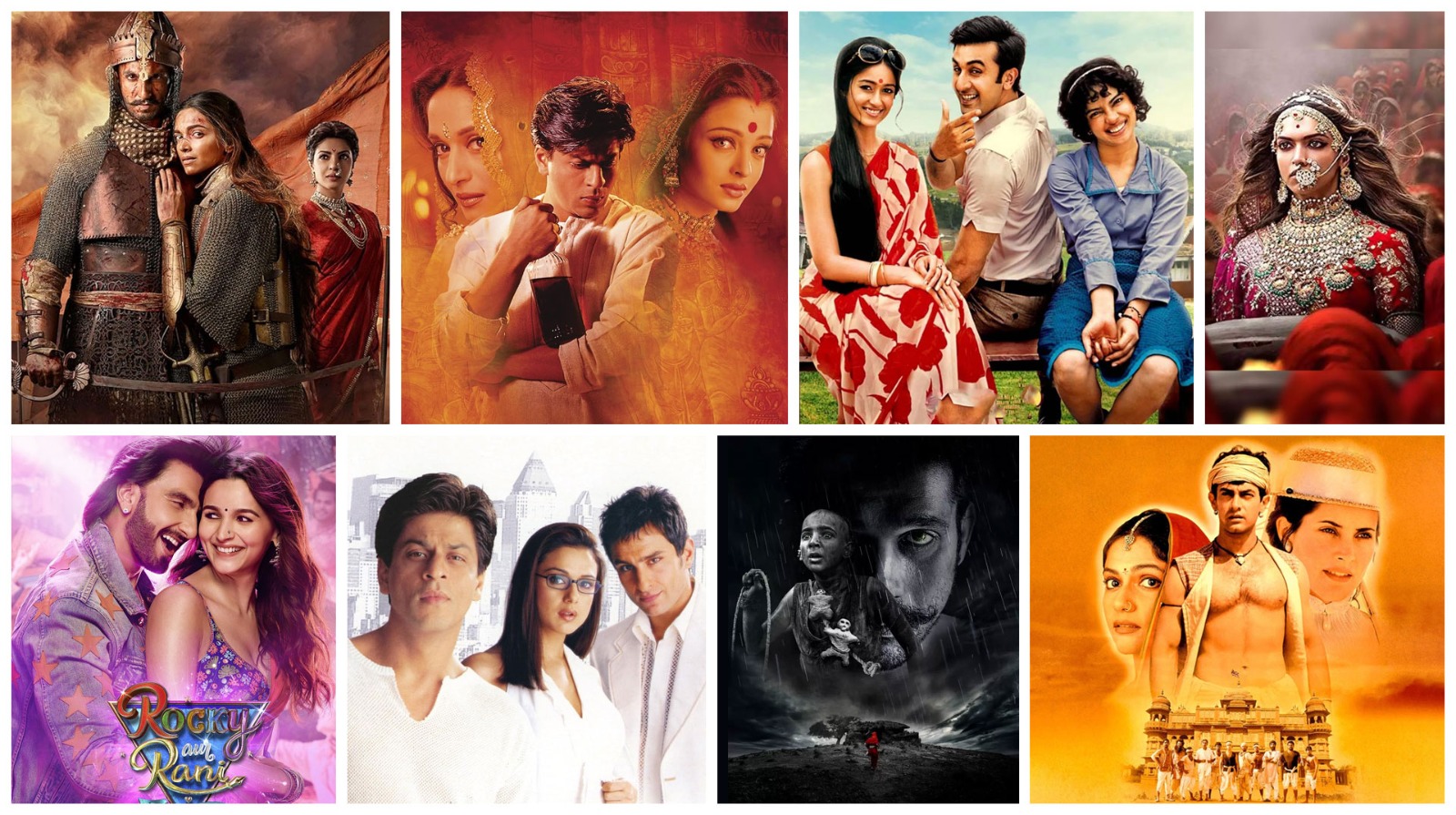
Bajirao Mastani (2015)
Sanjay Leela Bhansali’s masterpiece is set against jewel tones such as emerald, gold, and deep red, amplifying the Maratha court's grandeur. The song' Deewani Mastani' alone is a course in colour harmony, with soft golden light and peacock blues, to convey love and devotion. Bhansali combines the opulence of architecture with the richness of textiles, transforming every shot into an artwork. The palettes fluctuate between signifiers of royal elegance, doomed romance, and heavy history, solidifying the film as a visual and emotional accomplishment.
Devdas (2002)
This tragic love story uses colour as a language of emotion. Paro's world is awash with shiny reds and warm ambers of love and pride, but soft, sensual golds and browns surround Chandramukhi. The visual journey parallels Devdas' psychological plunge—from bright, vibrant riches to pale, muted despair. Bhansali's use of colour amplifies the drama and loneliness included in the non-physical spaces. In scenes set in the brothel, he has used mirrors and sets of crimson light in Paro's haveli. Few films have an impactful sense of pain and beauty through palettes like Devdas.
Barfi! (2012)
Anurag Basu translates a silk-hearted romantic fable from the silent into a visual fable washed in sepia, muted pastels, and old-school filters. The colour palette plays to a nostalgic, innocent and whimsical sensibility - very much in the spirit of Barfi's sweet and Chaplinesque naivety, and Jhilmil's earthly world of gentle chaos. The lists of greens in nature, combined with the russet tones of Kolkata's streets, only heighten and solidify the film's timeless grounding, while still carrying the essence of magic. The film's emotional arc is in its palettes, though - all three of its narratives, on disability, romantic love, and sacrifice, are wrapped in soft, sunny framing that evokes feelings of humanity.
Padmaavat (2018)
In Padmaavat, Bhansali uses the colours of royalty to paint his story—Rajput reds, Rajasthani golds, and Mughal metallics —to create a noble and warm world for Padmavati, one made with earthy hues that signify honour and virtue. In contrast, Khilji's kingdom is depicted with dark, shadowy greens and greys, suggestive of barbarism and threat. The confrontation of each world mirrors the ideological and ethical battle at the story's core, and between each costume and corridor is a piece of art, where colour locates opposing identities of light and dark.
Rocky Aur Rani Kii Prem Kahaani (2023)
Karan Johar has returned to his flamboyant roots, employing bold, hyper-saturated colours to emphasise cultural conflict and family discord. The song "Dhindhora Baje Re" is a visual frenzy of crimson drapes, golden idols, and similar costumes; it evokes both Durga Puja and the importance of reconciliation. The pink in Rocky's wardrobe and Rani's silk saris displays individuality, while the clash of colours symbolises the contrasts between Rocky and his social class. The filmmaker crafts a colour-coded and cleverly fun love story that is powerful and unapologetically colourful.
Kal Ho Naa Ho (2003)
Nikkhil Advani blends emotion into aesthetics through tone, using a cooler palette of silvers, whites, and soft pastels to express love, impermanence, and longing. Aman’s white kurtas reflect the celestial qualities of white, symbolising Aman’s angelic, cosmic presence, while bright red distinguishes crucial emotional moments, like Naina’s awakening to love. New York’s skyline contrasts with the inner emotional turmoil, based on the characters' inner lives, which are dreamlike and surreal, accentuated by a gentle blue tonality in night scenes. In subtly exploring light and shade, the nuanced use of colour unravels the shift from romantic comedy to tragedy, a narrative duality embodied by colour.
Tumbbad (2018)
Tumbbad employs a haunting, desaturated palette of rusty reds, burnt oranges, muddy greens, and shadowy darks, even in its illustrative use of light, to depict rot, greed, and decay. With unrelenting rainfall and dark, candle-lit interiors, we are thrust into the chiaroscuro nature of the film, feeling the weight of dread. The film's palette mirrors the protagonist's obsession as he explores the womb vault and the children's worship of this mythical vault, as depicted in a sinister bronze. Every frame feels hand-aged and mammoth, marking Tumbbad as one of the more visually unique Indian films in recent memory.
Yeh Jawaani Hai Deewani (2013)
From the technicolour maelstrom of Balam Pichkari to the cool blues of Manali and Paris, this film helped us visualise the transformative process of youth. The opening scenes are awash in festival colours and warmer tones, representing the spontaneity and freedom of youth. Later scenes, on the other hand, swap warm hues for cooler, more mature ones, which help signify emotional evolution and stable choices. The shift in colour from energetic festival hues to slower, cooler hues mirrors the internal transformations of Bunny and Naina when we experience their love story, both in a dreamy and perceptual sense, and in a whimsical and reflective sense.
Lagaan (2001)
Ashutosh Gowariker’s epic is set in rural India's parched, dusty browns, with dry yellows, clay reds, and beige costuming that highlight the colonial suffering and agrarian resilience. The starkness of these colours highlights the divisions between the British characters, who wear crisp and cool whites and military blues, which contrasts with the power dynamics. As villagers gain hope, the colour subtly represents warmth, until the climactic match when light is used to amplify the tension. Lagaan’s earthy organic colour palette expresses nationalism, unity, and underdog bravery, without resorting to visual excess.
Haider (2014)
Vishal Bhardwaj's adaptation of Hamlet douses Kashmir in frozen greys, jarring whites, and sadistic blues. The bleak colour palette captures the splintered psychology of Haider and the oppressive chill of insurgency. Winter is the setting, the metaphor, and the feet of Haider chillingly marked by the blood of Hilaal in contrast to the frozen landscape. The angles and whirling shafts of light are omnipresent in Haider's interiors, creating oppressive, scuzzy, tactile spaces that reflect a decaying moral universe. This muted and haunting visual quality is part of the film's emotional weight and socio-political commentary.
Tamasha (2015)
Imtiaz Ali contrasts bright, outlandish Corsican landscapes with the dull greys of Ved's corporate life in Delhi. The oranges, turquoises, and golden hour of Corsica signify freedom and uninhibited happiness. As Ved conforms, his world loses colour—the monochromatic colours of the office mirror his inner turmoil. The palette shifts again when he embraces his identity. Ravi Varman's cinematography ensures the colour itself becomes character—a mood ring of Ved’s emotional world.
Black (2005)
Sanjay Leela Bhansali's exploratory palette works through absence—black, grey, and white shape this tale of a blind and deaf girl's journey. By omitting colours, Bhansali has emphasised texture, shallowness and emotional response. Shots in candlelight and sequences with crisp snow provide brief moments of illumination in many different ways, indicating hopefulness and change. The film's minimalism creates a powerful sensory storytelling sensation, demanding the audience 'feel' through tone and light. Black uses visual silence to describe a world beyond sight and sound.
Gully Boy (2019)
Zoya Akhtar presents Mumbai in dark realism—rusted rooftops, graffiti walls, and metal. Earthy browns and industrial greys present a dreamlike reality. The night's neon captures a world filled with drained hope and stale ambition. The absence of colour becomes metaphor: Murad’s dull existence struggles to extract energy from the hip-hop culture that brings visual and emotional colour into his life. Scenes brighten as Murad finds his voice; colour morphs into liberation, reflecting the rhythm and rise of the underground.
Bhaag Milkha Bhaag (2013)
This biographical movie about Milkha Singh uses a vibrant and energetic colour scheme to depict the running scenes somewhat loudly. The shot choices, colour schemes, and dynamic camera angles in the first shot visually depict triumph and the runner's journey.
Mughal-e-Azam (1960)
The movie was black-and-white, but when it was re-released in 2004, it was hand-coloured. It revealed the Mughal world—those peacock greens, scarlet veils, and the gold-drenched courts. Anarkali's red in Pyaar Kiya Toh Darna Kya evoked an instant legend of defiance and passion. Each frame feels like a tiny painting. The sumptuous palette heightened the stakes emotionally and the scale historically. Even now, decades later, the simple cinematic memory of it is more than sufficient.
Ram-Leela (2013)
Bhansali blends Gujarati folk layers with intense operatic extremes, using a red, saffron, and blue palette that amplifies love and ferocity. According to Bhansali, the colour palette peaks to highlight emotional crescendos—the colours deepen—and during highly charged content such as the vivid red holi sequence or funeral black. The elaborate costumes, rangoli, and architectural structures become emotive expressions. In Bhansali's film, the colour palette reflects the passionate intensity of the lovers and the violence of their violent feud, wherein the love story becomes a hyper-reality, a visual opera of love and doomsday.
Saawariya (2007)
Another Sanjay Leela Bhansali film, Saawariya, used a blue colour palette to portray the dreamy and tragic appearance of the film, according to a blog post on Social Ketchup. The blue palette creates an ethereal and romantic mood, as described in a blog post on Social Ketchup, complemented by the pastel colours.
Guzaarish (2010)
This Bhansali film uses Victorian bitterness with muted aquas, weathered teals, and twilight greys. The Portuguese villa is an archetypal collapsing fallow space, symbolising Ethan’s failing body, unyielding spirit, and time to go. Aishwarya's rich blood and ebony clothes persistently contrast with Ethan’s pale surroundings, representing restraining vitality relative to an already dead, radically neglected body. Rainlight, candlelight, and dust-motes made for a theatrical stillness. Graceful in a visual, sorrowful palette, the palette hand-paints suffering, where death becomes art.
Rang De Basanti (2006)
From a coming-of-age story to a break into revolution, RDB exemplifies a use of colour transition. The first half is full-blown saffron, green, and youth. As political realisation intensifies, we switch to sepia and faded colours. The flashbacks of India's freedom struggle are sepia with dusty vintage filters. The amplitude of emotion becomes darker but slowly, until we reach an ending coded in tricolour, in a way that links the youth protest to the sacrifices made before them.
Jodhaa Akbar (2008)
Ashutosh Gowariker creates regal elegance with saffron marigolds, emerald drapes, royal blues, and metallic golds. Every courtesan scene basks in candlelit glory, and Jodhaa’s red bridal dress will be memorable. The Mughal-Rajput dialectic is expressed through the tones of the architecture — cold marble versus warm sandstone. As a love story rooted in political alliance, the colours inspire trust, spectacle and solemnity in every image.
Om Shanti Om (2007)
Farah Khan’s retro-romantic tribute shifts between 1970s technicolour excess and 2000s sleek glamour. Neon pinks, sequinned golds, polka-dotted sets, and psychedelic discos define the first half, while reincarnation is marked with cooler palettes—metallic greys, icy blues, and corporate blacks. The kaleidoscopic shift signifies time travel and generates tonal contrast in a technicolour way. In this aesthetic, colour serves more than as a prop; it is a fundamental part of parody, nostalgia, and homage, and allows for visual punchlines.
Gangubai Kathiawadi (2021)
This film has a contrasting white and red colour palette to symbolise Gangubai's journey and transformation. White represents her innocence and initial vulnerability, and red signifies her resilience and strength as she traverses the stark realities of the underworld (Architectural Digest blog).
Queen (2014)
Vikas Bahl's shifts in colourpace accompany Rani's transformation. Delhi is shown in greys and muted colours, which are conservative and suffocating. As she moves from Delhi to Amsterdam and Paris, the colours shift to vibrant hues – floral prints, café yellows, and neon street art – representing liberation. The colour trajectory mirrors Rani's journey from heartbreak to self-discovery. Queen recognises female independence by using warm, affable, and chaotic visuals.
Regional Influences and Cultural Symbolism
India's rich cultural diversity means that colours have different meanings in different regions. Bollywood frequently harnesses this symbolism by employing colour to provide authenticity or resonate with specific traditional value systems, as seen in the example provided in Lagaan (2001) above.
For example, in Hindu culture, white is often associated with mourning. In Water (2005), Deepa Mehta saturates the film in white - the widows' dress codes and stark environment are all bleached out, conveying an immense sense of austerity or a whining, oppressive existence, akin to the extreme limits of existence that the women filmmakers have written about in our readings.
In Lagaan (2001), dusty ochres and earth tones reflect the rural, drought-stricken village of Champaner, and the film is rooted in this colonial-era setting. The climatic contrast when the British appear in clean and bright uniforms communicates power and control dynamics—this is evident when we look at colour against a spectrum of power or control.
The absence of festivals also leaves cultural colour symbolism - the Holi sequence in Yeh Jawaani Hai Deewani did not feature bright colours—still, powder genres to dissolve inhibitions and show the triumph of love over all.
Colour Grading and the Digital Era
Bollywood's use of colour has become more sophisticated and adventurous thanks to the production possibilities of digital colour grading. Post-production tools allow filmmakers to adjust the colour tone of entire scenes, creating specific emotional effects or synchronising the visual tone.
For example, Meghna Gulzar's film Raazi (2018) features a muted teal and sepia colour palette throughout. This muted look creates a sentimental yet tense atmosphere, perfect for the spy thriller genre. Andhadhun (2018) also uses stark contrast with a palette of cold colours to build suspense and have audiences second-guess what is real versus imagined.
Digital technology enables colour correcting for all kinds of intentional continuity or even to create an emotional crescendo. Colour is no longer only captured on camera, but also crafted in the editing room, giving directors even more visual control.
The Takeaway
Colours are not simply surface elements; they are mechanisms of narrative. For Bollywood and hyper-emotional narratives, colours combine metaphor and aesthetic. Colours give dimension to character arcs, amplify a context of conflict, and in subtle ways, become unspoken narratives.
Consider Bollywood colour and emotion. Colour is a stealthy and compelling storyteller since co-opting the heavy scarlet colours of doomed love, to blue hues that illustrate emotional detachment—colour functions as a micro-narrative. Bollywood directors use colours to deepen the mood of a moment; they act as powerful signifiers and emotional registers that tap into empathy. As Bollywood continues to rationalise itself, embrace cinema contemporaneously, and experiment, the emotional punctuation of colour can only increase.
Bollywood frames exist as fewer moments of entertainment than delicate moments of moving visual narrative. In a nation where colours have religious, seasonal, and symbolic connotations, Bollywood is the greatest canvas for emotion, culture, and story in this country, throwing doses of colour, emotion, and cultural narratives onto the screen.
By understanding how colours are chosen, manipulated and used in the post-production process, audiences can add another layer of meaning to their appreciation of the film, beyond what was scripted or performed. Filmmakers create emotional productions when they understand how to affect a colour palette. The colours become a symphony of emotion; colour, shade and contrast carry thousands of unwritten stories.
2022 © Milestone 101. All Rights Reserved.